Showing posts with label Summer. Show all posts

Wednesday, 16 May 2012

MAC Hey Sailor! Fleet Fast Blush Review and Swatches


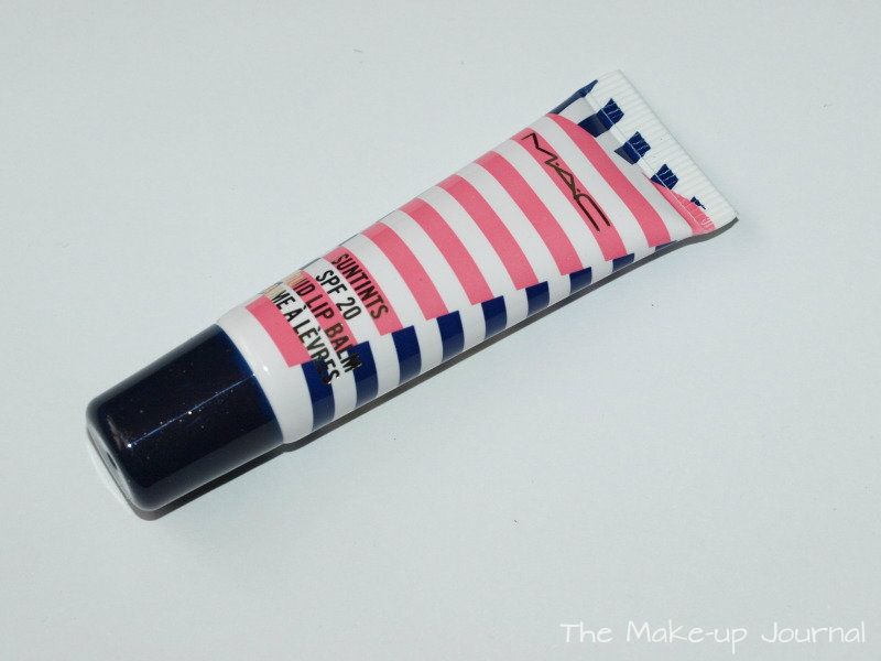
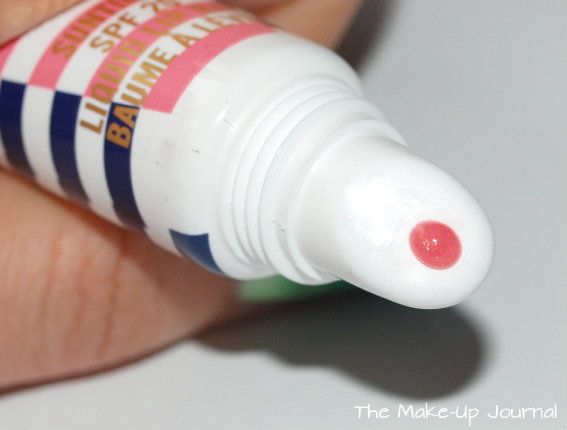
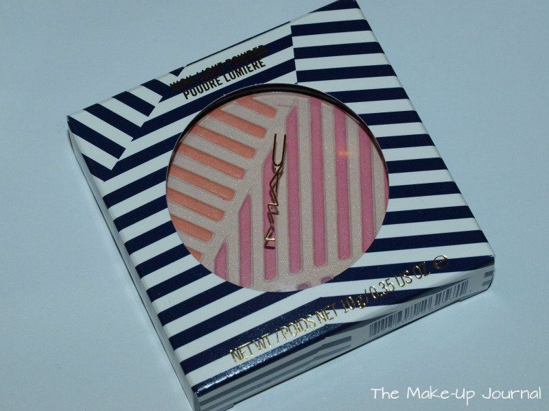
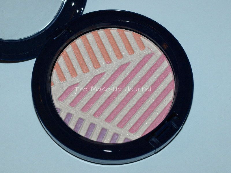
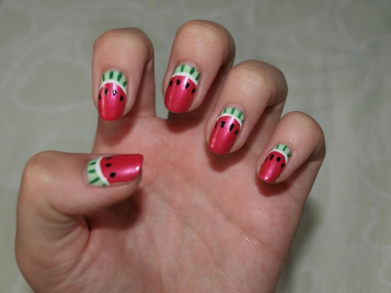
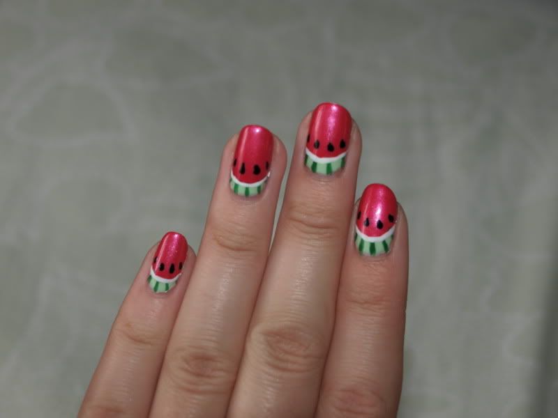
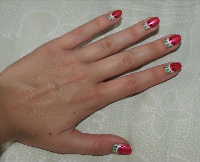
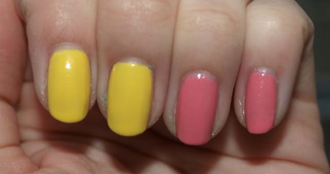
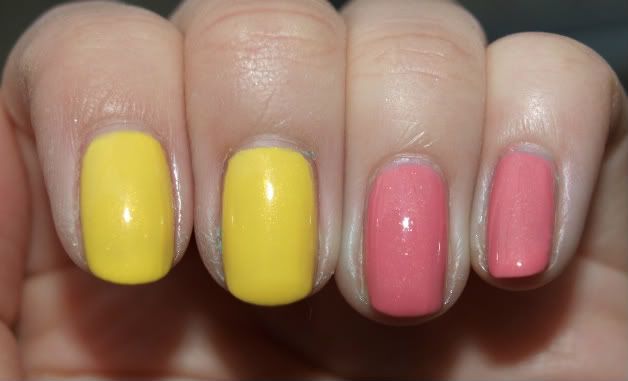
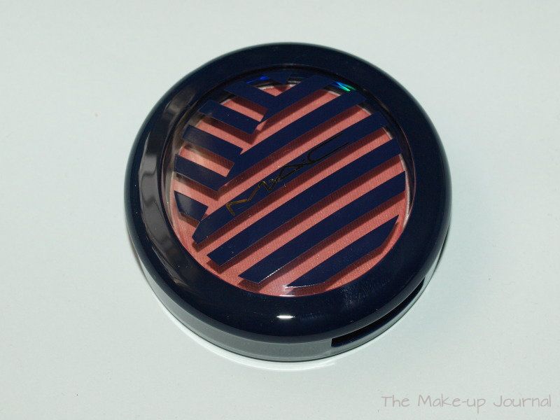
After binging out on all of the Tres Cheek blushers (if anyone wants a review on any of them, leave me a comment and I will get one up for you) I intended not to buy any of the blushers from Hey Sailor... that didn't work though haha. I bought Fleet Fast and it is such a perfect natural colour on my skin. I simply love it.


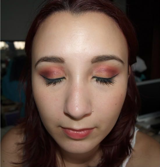
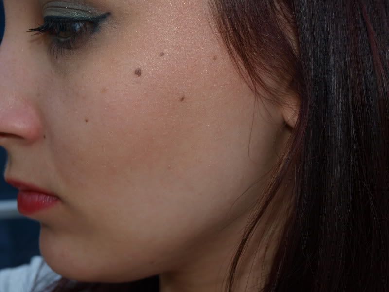
My new love with MAC's blushers is their satin finish which has been in the latest blush offerings. They are perfection in a pan, I honestly can't rave about them any more. I've always been a bit wary of matte blushers on my dry skin and I usually prefer a bit of shimmer. The satin finishes that MAC have come out with recently have just looked so flawless on everyone's skin that I've seen them on and I know that a lot of people are really chuffed with them. They give such a natural finish which doesn't look completely matte, instead giving skin a slight sheen which actually looks just how skin should - not caked in makeup.

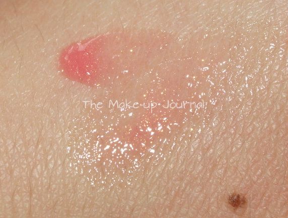
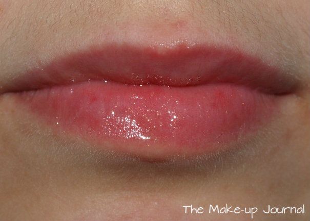
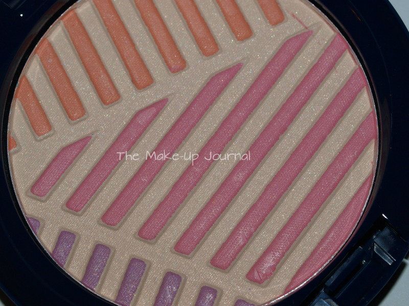
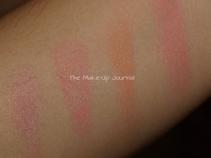
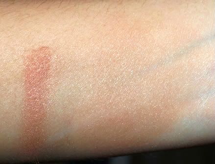
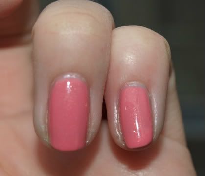
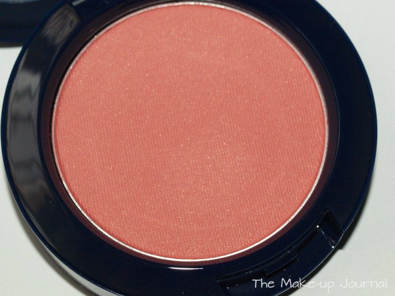
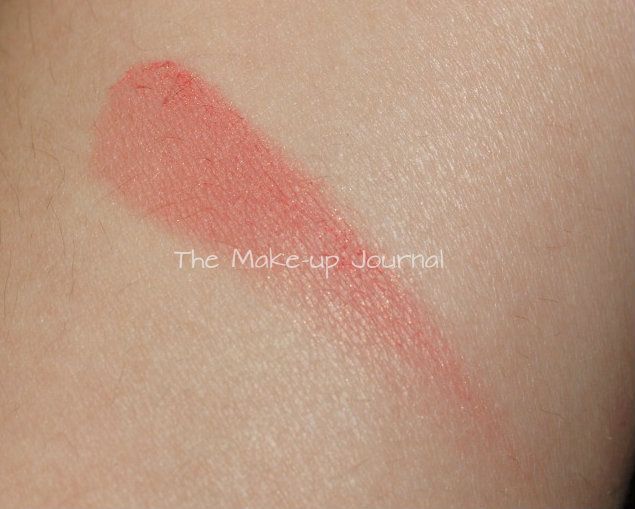
Fleet Fast has some fine gold shimmer in it which is quite subtle on the skin - you can see it but it is far from being a glitter bomb on your face. It is very flattering. I adore the colour too. It doesn't seem all that unique but the formulation is what makes it a must have for me. The shade is somewhere between pink and coral but with an earthiness to it. It gives my cheeks a natural flush which also appears like I've been in the sun, I love it.

It also has really good staying power, lasting almost all day on my skin - bearing in mind that I have dry skin so it might not work as well on normal to oily skin types.


So if I can recommend that you try something from this collection, this would be one of my top picks.

Jennifer xx

MAC Hey Sailor! Au Rose Suntint Review and Swatches


Suntints are products that MAC tend to put out with Summer collections, there were some with last years Surf Baby collection but I skipped them due to lack of pigmentation. This year, 3 new shades are available and I chose Au Rose which was the most pigmented of the three.

Some days I just want a subtle colour on my lips which will also moisturise so tend to go for balm which has a little bit of a tint in it. Au Rose is a pretty pink coral with gold shimmer and would be flattering on all skin tones. The amount of colour that shows depends on your natural lip colour. My lips are quite pink naturally so I don't get much colour added to them, Au Rose just makes them look healthy and glossy with pretty gold shimmer. I really like it and have been wearing it for the past couple of days.

It is really comfortable on my lips, it isn't overly sticky like a gloss but does have some tackiness. I've not had my hair flying into it though. It lasts pretty well on me even through eating and drinking, a good few hours later it is still hanging around and the shimmer lasts longer than the balm. It is not the most moisturising balm but while it is on my lips it provides enough protection to not let them dry out. My lips are very dry so most balms aren't enough to deal with them.


The Suntints also have the added bonus of SPF 20 which is great for the Summer (if it ever stops raining in the UK!). Using a balm with an SPF in it will ensure that your lips are protected through the heat. They are also very easy to apply, simply by squeezing the tube and out it pops from the plastic applicator. I love how they are fuss free so no need to dip fingers or brushes into a pot and you can clean the applicator when needed.


Jennifer xx

Tuesday, 15 May 2012

MAC Hey Sailor Crew Highlight Powder Swatches & Review

Now, before I start this review, I wouldn't have bought this had I not seen it in store and swatched it. I just wasn't bothered by it before but really liked it after I tested it out. I'm glad I got it because it is so pretty on my skin.


I've been really into highlighting lately but already have a few of them so didn't want to bother with this. I also thought that there was an overspray on it which would come off after the first use and make it another bog standard highlighting colour. I still don't know if it is actually an overspray - I'm not willing to go digging through the powder to find out - but it is quite thick if it is so will last a while. I've used it a few times and it doesn't any different in thickness than when I first got it.


The powder is made up of three shades, all of which are impossible to select individually as they are so thin. You can choose an area if you prefer though but I've been using it all swirled together. It is actually very well pigmented for a highlighting powder and works nicely as a soft blush on me. I didn't imagine that the payoff would be as strong as it is. I really like it as it gives a glow as well as a blush. Darker skin tones may find that it only works as a highlighter with a pink tone to it.


I actually really love this powder, it looks so nice and natural on my skin. It is one of the best colours I own on me. I like that it is not a high shimmer finish, giving more of a glow than high sheen or frost, making it suitable for a wide variety of skin types and shouldn't emphasise pores. I have dry skin and find that the powder lasts a whole work day with some slight fading. Normal to oily skinned people might find that it doesn't perform as well on them though. I really hope the colours work all the way through the powder although I'm not sure that they will do as most of MAC's powders like this don't. Even if it doesn't, I think the beige shade will look good due to the great finish.

The three top colours swatched, the last swatch being the whole powder swirled together.
I would recommend that you try this powder in store if you get the chance in case the colour doesn't show well enough for your liking.


Just to confirm, the pink, peach and lilac are not an overspray. In fact, the beige is the overspray but it is quite thick. Temptalia has dug into her powder and discovered that the colours seem to be arranged in a similar way to Benefit Sugarbomb so in other words, there are chunks of each colour which meet up and then the beige is sprayed over the top in a thickish layer. I don't think the colour will change a whole lot when the overspray is worn down :)

You can see Temptalia's review with the photos of the excavated powder here.


Jennifer xx

Tuesday, 2 August 2011

Using Sleek's Monaco Palette - Mermaid Teals

My next look with Sleek's Monaco palette was inspired by mermaids, the blues and greens of the sea and shimmer. Green and teal are also my favourite colours to wear on my eyes, I think they bring out the green tones in them. I decided to put purply pink lips with it to finish off the bright look.


On my eyes I used Kiwi Zest (shimmery lime green) as the base colour, I added Aquamarine (matte turquoise) into the crease and blended upwards and slightly onto the outer part of the lid. I used Humming Bird (shimmery teal) through the crease to add definition and sparkle. Then I used Bamboo to blend all of the colours together nicely under the brow bone and to neutralise the pink in my brow bone. I applied Sunset (shimmery copper) along the lower lashes.

On my lips I wore MAC Rebel lipstick, gently patted on and smooshed together with my lips and then topped it with MAC's Fab Fun lipglass (this was limited edition with one of the lipglass sets from Tartan Tales last Holiday season - it is a sheer pink with iridescent sparkles, really pretty)

More Pics!

Monday, 1 August 2011

Watermelon Nails

I already had OPI Gargantuam Green Grape on my nails and wanted to jazz it up a bit. The colour reminded me of the stripes on watermelon skins so I decided that I'd do some watermelon nail art.


What I used:
Base colour: OPI Gargantuam Green Grape (light green)
OPI Come To Poppy for the watermelon flesh.
Rio Nail Art Pens for the white, darker green and black.

How I did it:
First apply base coat, I use OPI Nail Envy as a base and treatment - 2 coats, as per instructions.
Then apply two coats of Gargantuam Green Grape (or a light green).
Apply Come To Poppy in a semi circle shape, leaving a smallish gap in the green, one coat.
Let it dry and then use a green nail pen - I used the brush within - or a darker green on a detail brush to paint in the darker green stripes.
Use a white nail pen with a brush or white polish on a striper or detail brush to draw the white line between the green and pink, it will tidy up any mistakes and neaten up the edges of the pink if it isn't quite perfect.
Use a black nail pen and dot on little black dots for the seeds and before lifting the pen away, gently drag it down to create teardrop shaped seeds. You could use a toothpick or a teeny dotting tool instead with some regular black polish if you don't have a nail pen.
Let the polish dry and then apply a topcoat, I use Seche Vite. It is important to let the design dry first otherwise the topcoat will drag it.

I was really pleased how it came out and got quite a lot of compliments on them. I think Come To Poppy works well due to the iridescent in it which looks a bit like the flesh of a watermelon.

More pics!


What do you think?

Jennifer x

Wednesday, 20 July 2011

Using Sleek's Monaco Palette - Cranberry and Lime

Yesterday I put together another look using Sleek's Monaco Palette. This one took a bit of time to get looking right, it didn't start out very well but I stuckwith it and it worked in the end. I have liked using a contrasting colour along my lower lash line so did that here too. It also worked quite nicely with my hair colour at the moment which is much redder than it appears in the photos, going towards the cranberry shade on my eyes.


Heres what I did. I applied Washed Ashore (matte peach) over my whole lid then applied Sunset (shimmery coppery cranberry) through the crease with a 222 brush to get very soft difused shading as it faded out. I used Moors Treasure (matte plum) with a pencil brush right in the crease to add definition. Then I went back with the 222 to soften and blend into the cranberry. I added some Moors Treasure onto the outer part of my lids too and blended into the peach. I used Bamboo under my brows to sharpen the edges and blend into the other shades. Bamboo doesn't show up much on me but it works very well at neutralising redness and discolouration or blending together colours. Finally I used Kiwi Zest along my lower lash line. I didn't want a highlight colour as I felt I had quite a bit going on with the shimmery cranberry and lime.

Other products used:
UDPP
Philosophy Poreless Flawless Primer
Chanel Vitalumier
Bobbi Brown Corrector and Creamy Concealer
Sleek Luminous Pressed Powder
MAC Semi Precious Goldstone MSF
MAC Spiked Brow Pencil
Bobbi Brown Gel Liner in Black Ink
Chanel Inimitable Intense Mascara
MAC Gem of Roses Lipstick

Jennifer x

Monday, 6 June 2011

Bronze Corail Soliel Tan de Chanel Review - Summer 2011


There are two versions of bronzer in Chanel's Summer 2011 collection, Bronze Corail and Bronze Rose. I chose Bronze Corail because I always tend to prefer corals over rose colours and I'd been using my MAC Stereo Rose MSF a lot so wanted something else corally but I'd also been into bronzers, this seemed to fit the bill.

It is a striped palette, it reminds me a bit of Bobbi Brown Shimmer Bricks (but much less shimmery). It has four shades of powder, a bronzey brown, a pale peach, a deeper brown and a pink coral. All of the colours are on the warm side so definitely more suited to warmer skin tones. They can be used alone if you want, the thin rectangular brush supplied allows you to pick each shade out individually. You could also use two colours together - the lighter brown with the peach for a subtle highlight effect, the peach with the deeper brown for a subtle bronze or the deeper brown and coral for a bronzed blush. Or you could use the top three shades together to get a beautiful bronzed look and then the coral alone as blush. You could even use the shades on your eyes if you wanted or was travelling light. When all of the colours are mixed together they create a subtle bronze with a champagne sheen, and light coral tones. Very pretty and hard to mess up as it is so subtle, yet buildable. However, if you want something more pigmented, this wont be for you.


L-R: Bronze Corail, Bronze Corail blended out.


The brush supplied is okay, not my favourite brush ever but it does the job. I found it a little difficult to use because I ended up with a bit of a stripe the first few times I tried it but after a few goes, I got the hang of it. I still prefer using a round brush with it however. I tried my MAC 129 brush, mine is quite rough unfortunately, it probably needs a good conditioning, but I found this buffed the colour out too much so I went for a softer brush instead. I chose the MAC 168 to diffuse the colour more gently so I still had it where I wanted it but could blend it better. This was also handy because of the angle in it so I could use the bronzer in other areas of my face such as around my temples with ease. A stippling brush might be a good choice too.

The compact is sleek as per Chanel's usual standard and it contains a very handy mirror in the lid which is the same size as the compact and allows you to see your whole face easily without having to do your makeup at arms length. You also get a nice suedette bag to keep the compact in so it doesn't get scratched and to minimise fingerprints all over the glossy black casing.

The quality of the powder is so soft so whilst it blends beautifully on the skin, it can kick up a lot of dust which I found annoying and made the compact very messy after each use so be careful when using it. Another downside is the price, it costs £32.50 for 14g/0.49oz so it costs £2.32 per gram compared to a MAC bronzer which costs £17.50 for 10g/0.30oz which works out as £1.75 per gram. So whilst you do get a lot of product and it is more versatile than a MAC bronzer which only contains one shade, if you are going to use it swirled together all the time, unless you really love the colour, consider something cheaper instead.

- Jennifer

Saturday, 28 May 2011

Les Fleurs D'Ete De Chanel Summer 2011 Collection - Mimosa & Morning Rose Review

Hiya! I hope everyone in the UK is enjoying their start to the Bank Holiday weekend, sucks if you are working though :( Thankfully I am staying at my boyfriend's house which is nice to have a little break from London for a few days.

L-R: Morning Rose, Mimosa
Today I have a review of two of the Chanel Summer nail polish colours, the highly anticipated Mimosa and beautiful Morning Rose. There was also another shade released called Beige Petale but that didn't appeal to me at all, I loves my bright colours! As soon as I saw the press releases for these I just loved the yellow shade. I only had one yellow polish, Barry M yellow - do not recommend unless you want to have finger that look like they've been dipped in a pot of American mustard... bleugh, not a good look and I was actually told by somebody else that is what my nails looked like :( Chanel's offering looked much more flattering.

I recently did a post on OPI's Fiercely Fiona which is a really pretty yellow but Mimosa is quite different, it is brighter and is shot through with a pretty golden shimmer which gives the colour some depth so it doesn't look flat. Chanel are very good at putting trendy colours out there but making them flattering.

Morning Rose is a jellyish colour and again shot through with gold shimmer although bigger particles in this shade. I wouldn't say it was a proper jelly because it is quite opaque but you can see the shimmer floating within the polish just like in a jelly finish. I found capturing the glitter difficult for both of these colours because the sun refused to come out and it has been horrible in London for the past few days so I couldn't re shoot the photos unfortunately. The pink is a nice flattering shade, it is a medium pink and has slight peach tones in it. Both of these colours are perfect for Summer.

Application was smooth on both, Mimosa needed a third coat to get true bottle colour and I used a third coat of Morning Rose because I didn't paint the second coat very well but I think a third coat gives it a bit more depth with the extra shimmer going through it. The polishes retail at £17 so they are expensive but Chanel often bring out really unique shades which you can't get elsewhere. The bottles hold 13ml/0.4fl oz of lacquer.

Here are a few pictures at different angles, hopefully the shimmer is visible in some of them. Mimosa isn't quite as bright in real life, I'd say one shade lighter but Morning Rose is pretty accurate on my screen.
L-R: Mimosa, Morning Rose

L-R: Mimosa, Morning Rose

L-R: Mimosa, Morning Rose

Mimosa

Morning Rose
I think they are sold out online now which is a shame so if you would like these colours I would call/visit your local Chanel counter to see if they have it there.

- Jennifer

Tuesday, 17 May 2011

Estee Lauder Bronze Goddess Island Oasis Eyeshadow Palette Review

Outer packaging.
Hiya! I bought this palette from the Estee Lauder Bronze Goddess Collection about a month ago-ish. It contains six shades plus an applicator and a mirror in the top. It retails for £31 but Debenhams have a sale on at the moment so you can grab it for £27.90.

Actual palette

The description for the palette is:
Shades of paradise.
Highlight, define and dramatize your eyes with the shimmering metallics and sunlit satin shadows of summer.
Luxurious compact contains 6 complementary shades to wear alone or together–the possibilities are endless


The shades in the palette are a blackened olive with bronze/gold shimmer, a yellow gold, a bright turquoise blue, a pink golden bronze, a copper and a greyed blue silver. The colours have different finishes, mostly shimmers apart from the blue which is matte and the silver which is frosty. All colours are well pigmented and the shade range work well together. I particularly like the yellow with the olive shade on my green eyes. The pink bronze seems like it has a subtle duochrome effect as it appears to change colour from a pink bronze to a gold pink in different angles according to how the light hits it. It is a very pretty colour. I think this palette is universally flattering on all skintones and ages and it is perfect for Summer. You can use it for subtle looks of brighter and more dramatic looks so is a good all rounder.


The packaging is nice, it is sleek and sophisticated, classic like all Estee Lauder products. It should appeal to all ages. The outer is made of a faux leather feeling material in a coppery orange shade, and embossed in gold. The applicator is useless to me, as all applicators are. If you do like the applicators in palettes, this one has a little brush on the other end for blending.

Value wise, I think it is worth it, you get six colours for £31 so that is just over £5 per shade. Considering that they are well pigmented and I have got a lot of use out of it, I am glad I bought it.

- Jennifer

Monday, 16 May 2011

OPI Fiercely Fiona


This has been on my want list for a while, it is from the OPI Shrek Forever After Collection which came out last Summer. I have a few of the other colours and love the formula so decided to get this one too as I didn't own a good yellow. I got mine from ASOS on sale £7.35. I love it. The formula is just how I'd hoped it would be, the same consitency as the other Shrek polishes I own - all two coats. It doesn't streak at all and applies evenly and levels itself out. The colour really appeals to me, I think it works well on my skintone and isn't too yellow, instead being more of a primrose yellow, making it more wearable. I've taken it off today and I miss it so I think this is going to become a favorite for me. Yellow is also a trend colour for this Summer with Chanel bringing out their yellow Mimosa nail polish soon.

So do you like yellow nail polish?

- Jennifer

Wednesday, 30 March 2011

OPI Nice Stems Collection Summer 2011

For this Summer, one of OPI's new collections is Nice Stems. It is made up of four pink shades in a variety of finishes. The collection is inspired by Summer flowers, each with it's own whimsical name to match it's floral counterpart. Each colour would work perfectly on both fingers to accentuate your outfit and toes to jazz up your flip flops. There is something for all occasions, a pale pink for a more demure or work appropriate manicure to bright fuchsia and a glitter to be used as a top coat or worn alone.

Here are the shades!
L-R: Play the Peonies (soft pink), Come to Poppy (shimmery coral pink),
Be a Dahlia Won't You? (fuchsia), I Lily Love You (light pink glitter).
They look so pretty, I look forward to them, especially the glitter! Be a Dahlia Won't You? reminds me of a pink I used to have which I wore so much but threw it away after it went really gloopy and stringy :( I don't think this will be a perfect replacement as it doesn't appear to have shimmer but it is still a lovely colour and very close to what I had.

- Jennifer

Monday, 21 March 2011

MAC Surf Baby Collection Summer 2011!


MAC are releasing a brand new collection for this Summer called Surf Baby, inspired by the sun and sea.

"Grab the board, hop in the Jeep, cruise the Pacific Coast Highway… Surf’s up! The lure of the endless summer starts here with My Paradise Cheek Powder, Mini Blush Sticks, a Summer Stash of Crushed Metallic Pigments, Hibiscus Lipstick and Splashproof Lash Mascara that just won’t smudge. Colourful, lustrous, and full of life… journey to a world where feeling the rush means taking a risk. Hang Ten!"


Blush - My Paradise (Coral orange with champagne gold flower)
Lipstick - Bust Out! (Soft violet), Hibiscus (Bright coral), Mocha, Naturally (Eccentric Nude)
Lipglass - Girl on Board (Sheer gold), Good Lovin’ (Peach pink), Krazy Kahuna (Medium brown), Strange Potion (Pink coral)
Crushed Metallic Pigment Stacks - Summer Stash (Pale pink, gray pink, purple, taupe), Surf the Ocean (Silver, aqua, gold, navy blue)
Eyeshadow - Saffron (Coral), Short Shorts (Whte champagne), Sun Blonde (Yellow with gold pearl), Surf U.S.A. (Aqua with teal pearl), Swell Baby (Medium gray)
Nail Lacquer - Hangin’ Loose (Beige), Ocean Dip (Aqua teal)
Eye Liner - Blue Noon (Teal), Gilded White (Shimmering off-white)
Bronzing Powder - Solar Riche
Studio Careblend Pressed Powder - Gold-go-Lightly
Tan Tint - Billionaire Bronze (Soft gold), Guilty Bronze (Copper bronze)

Blush Sticks and Suntints are also in this collection.


Read on for promotional imagery...

Friday, 4 March 2011

Illamasqua SS11 Toxic Nature Collection!

This is some information for Illamasqua's new Spring Summer 2011 collection, Toxic Nature, which releases on March 10th online and March 17th in stores/at counters. You can go to their website now and join the waiting list for products and be entered into a give away to win the whole collection!

The collection is made up of bright neon shades as well as murky and earthy tones to contrast it in pure Illamasqua style. This collection is about nature fighting back against humans destroying it. The promotional images show a sort of semi dead secret garden type landscape. I think the makeup is just incredible in these shots, they're real masterpieces. I don't know how Illamasqua do it, they just seem to outdo themselves every time.

Read on for more information!

Related Posts Plugin for WordPress, Blogger...