Showing posts with label green. Show all posts

Wednesday, 7 November 2012

Whimsical Ideas By Pam - Kee-Wee

Today I have an indie polish to show from a brand called Whimsical Ideas By Pam. Kee-Wee is a really fun looking polish. I love green so had to order it. It is a lime green with silver and green hexagonal glitter plus some bright green micro glitter. I love how the jelly formula gives it so much depth with the layers of polish over the glitter. And I only used two coats so you don't need to layer it so much like some jelly finishes. It also dries really glossy.


Pams bottles are so nice too, I love the labels and the bow details. I really like the shape of the bottles too with the tall cap. She has made them very unique compared to other brands on the indie market.


Slightly out of focus but hopefully you get the idea.

I ordered from her a while back although she now only ships within the US. US customers can find the details on her Facebook page and place your orders by emailing her with your list which she will send you an invoice for. Each polish costs $10.

Jennifer xx

P.S. most of my future posts wont have as nice photos as these, I no longer have access to my Mum's macro lens for my camera so making do with the lens that I have :( I need to save up over £500 for the one I used for these shots (Olympus 50mm F2 Macro Zuiko ED).

Sunday, 22 July 2012

Leighton Denny Shipwrecked and Drama on the Dancefloor


The base colour here is Leighton Denny Shipwrecked - a beautiful pistachio green creme finish from Leighton's S/S 2012 Castaway collection. It is a lovely colour with the same fantastic formula as the rest of Leighton's nail colours. Over the top I added Leighton Denny Drama on the Dancefloor (QVC exclusive) which is a chunky gold hex glitter with gold micro glitter thrown in. I used one easy coat and as you can see, it is easy to get even glitter distribution.

Please excuse the state of my nails in these photos, they were taken a few weeks ago when my nails were very dry. I also managed to knock my middle finger while the polish was drying so it has a mark near the free edge.


Jennifer xx

Sunday, 24 June 2012

Candy Lacquer - Sea Nymph


Today I have a polish from Candy Lacquer, an indie brand which you can purchase from her Etsy store here. It called Sea Nymph and is made from fine sea green glitter and a touch of gold fine glitter and some holographic teal hexagonal glitter added. It is a full coverage glitter in two coats and is super easy to apply. You will need to apply a couple of layers of thick topcoat to it as it is very gritty. I used a layer of Gelous and a layer of Seche Vite. It is so sparkly and will get a lot of attention. I also like that is a unique combination of glitter, I've not seen light green glitters like this before. I really like the heart shaped labels that Sandra uses, they are really cute and the design and typefaces used are fitting for her brand.

I only wore it for a day because I find all full coverage glitters chip very easily on me, I have a feeling it is the Seche Vite causing it. I might try layering them over a creme finish polish to see if they stick better. If anyone has any tips on getting any full coverage glitter to stay put for longer, please let me know.


Sea Nymph costs $8.00USD and is available at Candy Lacquer.

Jennifer xx

Saturday, 9 June 2012

Franken - Peacock Feathers

I have another franken to show you today. It is made up of blue, gold, greeny gold, and green glitters of varying sizes and also some strand glitters all in a clear base. I'm really happy with it. I was actually trying to make an opaque glitter but I think this is nice how it is and can be built up a bit although it would take a lot to get it opaque. I mixed the glitter into some fine blue glitter polish and added a fine gold glitter polish to it (these are the smallest glitter pieces) then put clear polish in to 'water' it down a bit. I'm calling it Peacock Feathers because the colours are peacock colours and the strands remind me of the long feathers.


For this manicure, I layered Peacock Feathers over OPI Jade is the New Black. I've also changed the shape of my nails recently, I had a couple of tears and some peeling and decided to get rid of it and chopped them down. Normally I go for an oval shape but I decided to make them more squared - squovalish. I didn't like it at first but it is growing on me, they are definitely more practical!

Jennifer xx

Thursday, 24 May 2012

Green-Blue Gradient Nails


Gradient nails have been on my to do list for a good while now and I've finally got around to trying it. I really like the way it came out. To do it I applied the lightest colour and then dipped a makeup sponge into the next darkest colour and sponged it onto my nails. I repeated with each colour until the darkest colour making sure that they blended together. It's not perfect but I think it looks good for a first attempt.


The colours I used were (in this order):
OPI Gargantuan Green Grape for the base colour
OPI Mermaid's Tears
OPI Fly
OPI Ogre The Top Blue


Jennifer xx

Tuesday, 22 May 2012

MAC Hey Sailor! - Powerpoint Eye Pencil Review and Swatches


MAC's Powerpoint Eye Pencils are very soft and creamy, the apply without dragging and last all day. I really like them. They don't smudge all over the place so I would hope that they would be good for the Summer months, especially with them being released with a Summer collection. They provide intense, opaque colour with one swipe and can be smudged before it sets. They aren't fully setting pencils, if you touch them, they will transfer but they stay well if left alone. They have such a pretty finish, there are pearlised particles in there giving a lovely sheen.  You might find that the gold is dupeable but the green is quite unique as most green eye liners seem to lean more blue or are darker. Bare in mind that these are not waterline safe although I've used the gold one on mine before I found this out and it was fine. If you have sensitive eyes, please don't use them inside your eyes. It is your choice whether to ignore MAC's warning though but it is probably a good idea to take notice of it.


Jennifer xx

Thursday, 10 May 2012

Fixation Polish - Blood of the Dragon


Today I have another nail polish from an indie brand, this time it is Fixation Polish. There are four colours available from Fixation Polish at the moment and they are all gorgeous and filled with beautiful glitters. I'm looking forward to new colours in the future as I will definitely be purchasing from the brand again.

This one is called Blood of the Dragon. It is a lovely deep mossy green jelly filled with a ton of glitter. There are gold, bronze, copper, brown and red glitters in various sizes. It applies really easily and the glitter doesn't sink to the bottom of the bottle - no crazy bottle shaking or fishing out the glitter needed. It is a really pretty and unique shade.


Jennifer xx

Thursday, 3 May 2012

A couple of makeup looks

I found these photos on my computer of some previous makeup looks that I have worn and never posted so I thought I'd put them up now anyway. I can remember what I'm wearing in these however.


The top one is the kind of makeup I wear a lot and the bottom one is what I tend to go for when I want to wear more colour on my eyes.

Jennifer xx

Sunday, 26 February 2012

Leighton Denny Friends of Dorothy Collection

I am a HUGE Leighton Denny fan, I simply love his range and have the majority of his colours. They are a pleasure to work with, they glide on effortlessly, wear well and are super shiny. There is a new kit available on QVC called the Friends of Dorothy Collection, it is a collection designed by one of Leighton's QVC viewers for a competition to come up with a theme for a QVC exclusive collection. This was the winner, inspired by the Wizard of Oz which I think is a great idea.

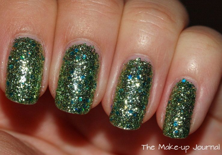
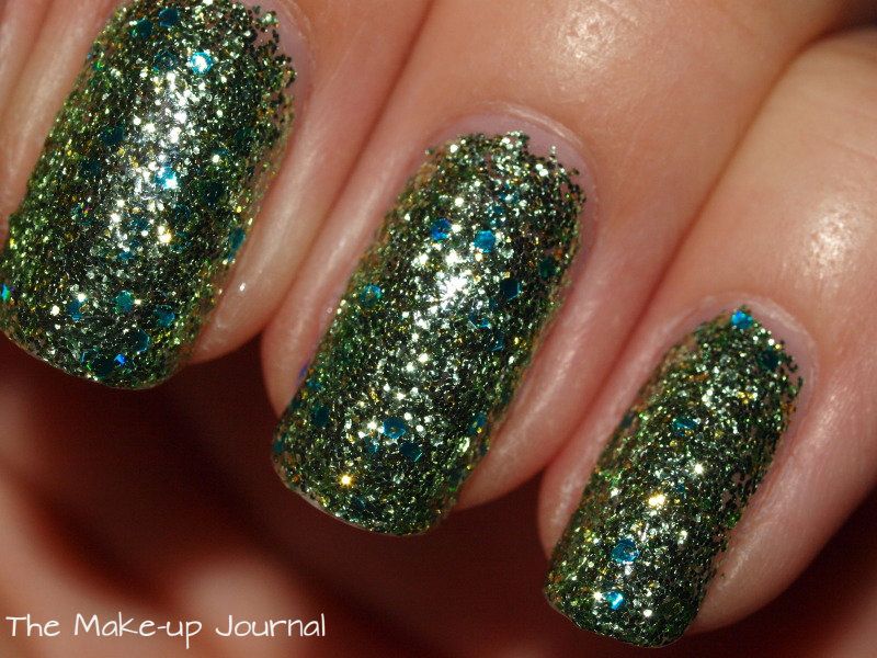
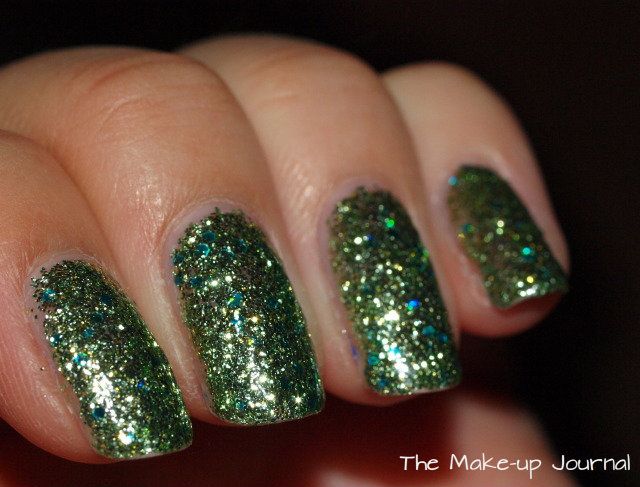
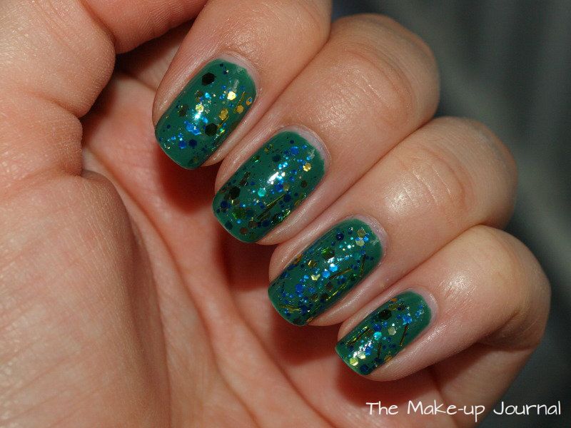
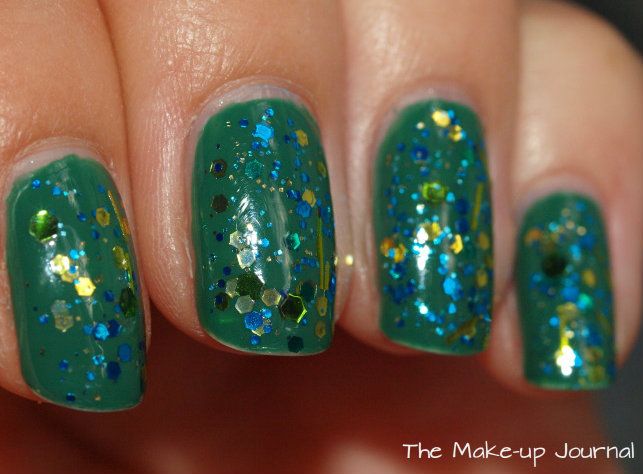
There are four shades in the kit, a chunky rainbow party style glitter, a deep shimmery green with blue micro shimmer shot through it, a yellow cream and a red glitter with green glitter mixed in. It all comes in a nice box so would be a perfect present for any nail polish or Wizard of Oz fan.


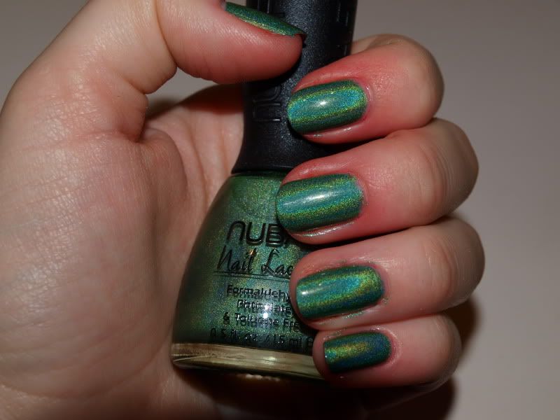
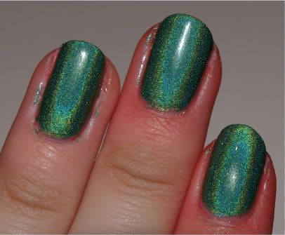
The colours themselves are the same great formulation I expect from Leighton. I'm never disappointed with his polish. The green and yellow are two coaters. The glitters work best with three coats to make sure there are no gaps between the particles.

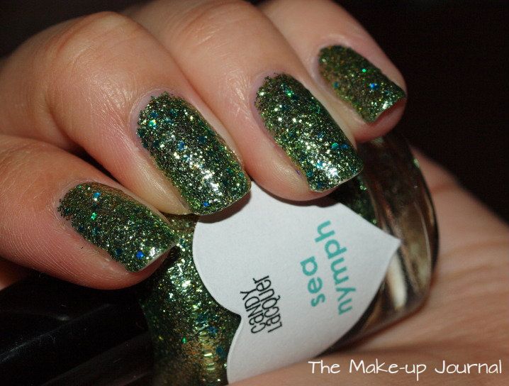
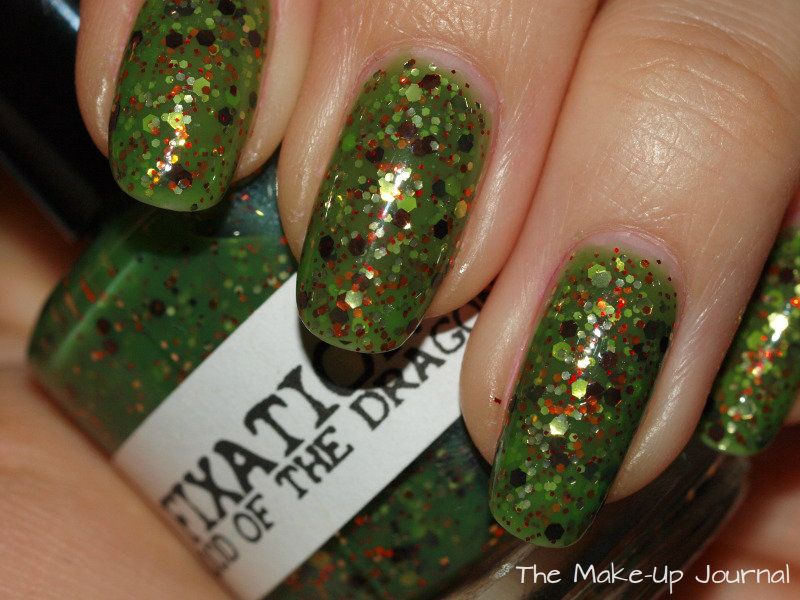
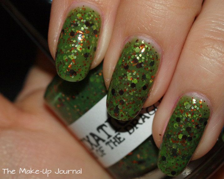
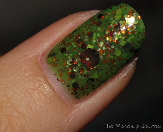
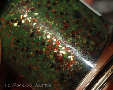
Ruby Slippers (red glitter) works as a full coverage glitter or can be used over another colour. It is not sparse however so it will still be quite dense over another shade so might be best to pair is with a red or even a green to go with the green glitter that is in it. Maybe a white or a gold would look good too. It would be a great colour for Christmas.


Over the Rainbow (rainbow glitter) is a little harder to work with, you do need to make sure it is dry between coats or you will end up dragging the coat beneath around. It is best to pat the glitter on and you can go to touch up any gaps at the end.  I didn't manage to get the glitter to stick to the tips of my nail because I was being inpatient so I went back later and added it there to get full coverage. It is very forgiving to would be good for ridged nails. It can also be used as a topper for other colours if applied thinly.


This is a little comparison between other multi coloured glitters I have.

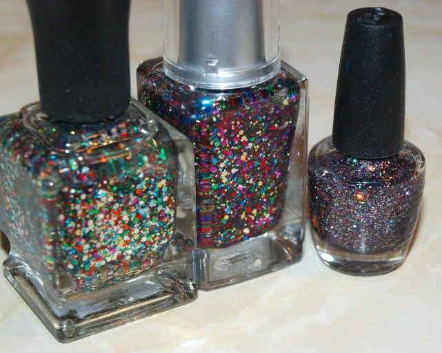
L-R: Deborah Lippmann Happy Birthday, Leighton Denny Over the Rainbow, OPI Mad as a Hatter
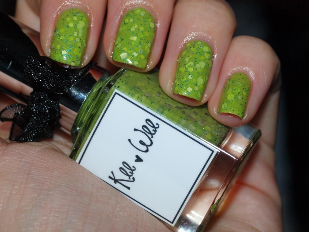
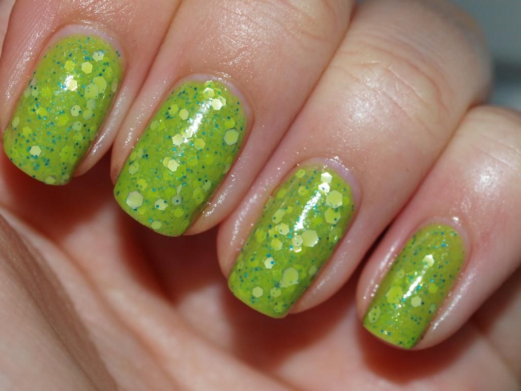
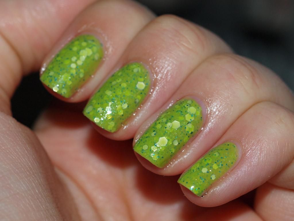
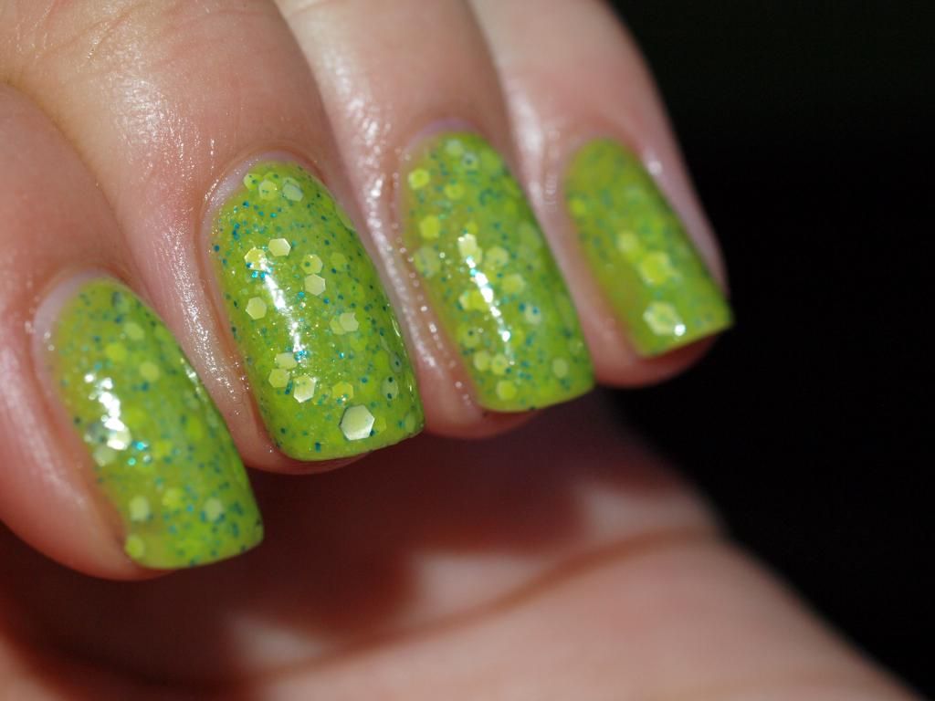
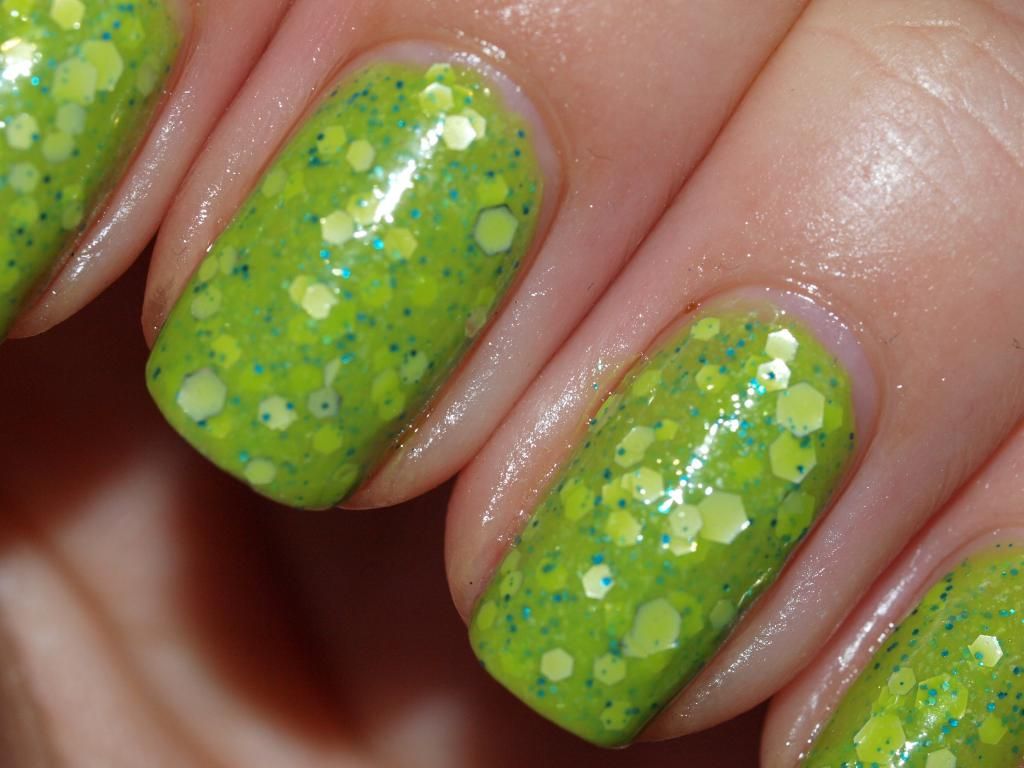
Emerald City (shimmery green) is my favourite from the collection. It is simply beautiful. You could get away with just one coat but I always use two for longevity and to get the full depth of colour.


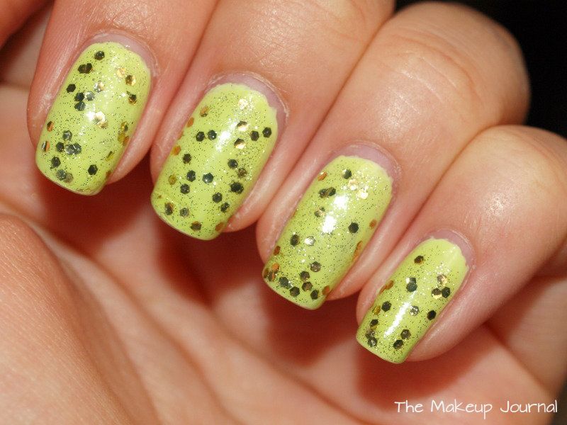
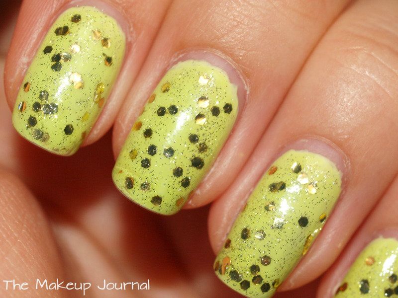
Brick Road (yellow cream) is a core shade in Leighton's line so can be bought at any time. This is probably my least favourite in the kit. I found it harder to wear against my skin tone. The awful manicure I did wasn't helping either. It is still a nice shade of yellow, it isn't too garish (think the shade of yellow that is hot dog mustard... ewww) is is more pastel but still remains bright. If you are familiar with Chanel's Mimosa, is it along the same lines of that but minus the shimmer. I think this would work better when I have a bit of a tan, it is definitely a Summer shade.


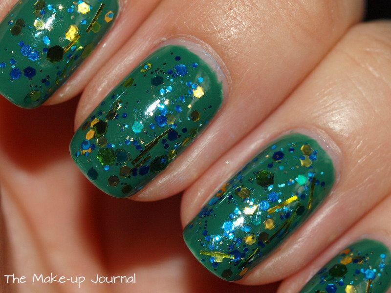
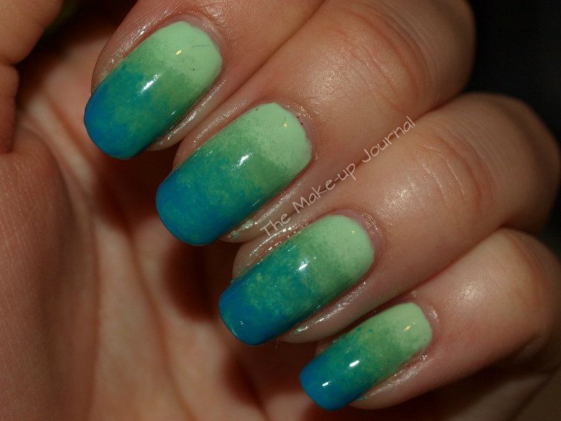
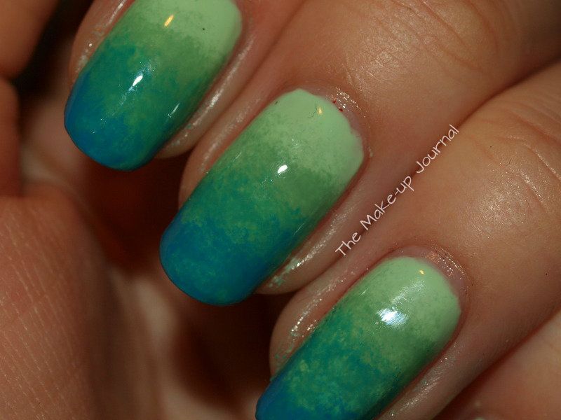
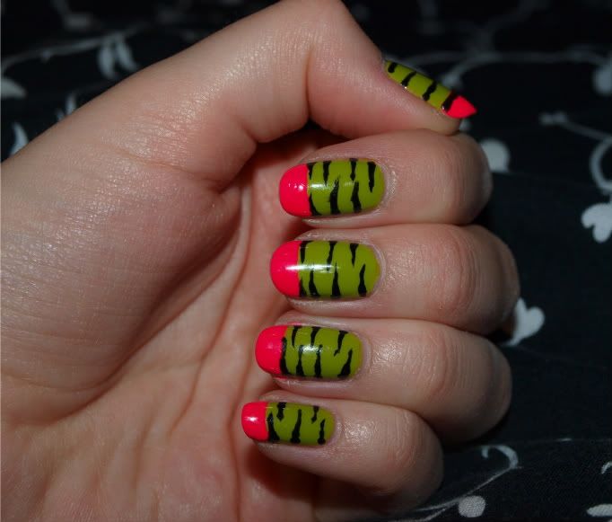
Here are a couple of manicures I've done with these shades. I liked the green and rainbow one but hated the yellow and red one, I removed it the next day :(


Jennifer x

Thursday, 20 October 2011

MAC Fall Colour Eyeshadows and Chromagraphic Pencil

Here are a couple of Eyeshadows and a Chromagraphic Pencil I picked up from MAC's Fall Colour collection. All are part of the 'Wild Colour' section which consists of some amazingly bright colours. I chose Three Ring Yellow and Royale eyeshadows and Hi Def Cyan Chromagraphic Pencil.

Three Ring Yellow

Royale


Three Ring Yellow is a bright yellow with a green undertone. It is a Veluxe Pearl finish so is very soft and pigmented. It is easy to blend and work with. I like that it has the green undertone so it isn't a straight yellow, some people may find it easier to wear due to the green in the shade. It is quite similar to Sweet & Punchy eyeshadow which came out last year with the To The Beach collection. If you have this colour you may not want to get Three Ring Yellow. Sweet & Punchy is more of a yellowed green apposed to a yellow with a green undertone, in other words, Sweet & Punchy is more green. Sweet & Punchy is also a Veluxe Pearl and a little more pigmented.

Royale is a deep blue with a purple undertone (I found this a very difficult colour to capture so these pictures are not accurate). It is a matte finish so can swatch a little chalky but when used it works really nicely. It is a little sheer but still pigmented enough although may require a bit of building if strong colour is required. If so, a shader brush such as the 239 would be best for that. I used it in my crease with a 217 to crease diffused blending but built it up where I wanted.


L-R: Three Ring Yellow, Royale
L-R: Three Ring Yellow, Sweet & Punchy
Top: Sweet & Punchy
Bottom: Three Ring Yellow
Chromagraphic pencils are a new product to me but I read really good reviews about Hi Def Cyan so decided to try it out. It is a lovely cyan shade, I really like to use bright blues and teals along my lower lashes so I knew I'd get use out of this colour. I am really impressed with it, it is so creamy and pigmented in just one swipe. It dries down and doesn't move at all until you take it off and even then it doesn't want to come off! Chromagraphic pencils are PRO products so are available all year round at PRO stores or via phoning mail order if you do not have a store near you. It is nice to be able to get a few of the colours at regular stores in the meantime though. Some shades are not eye safe, this particular colour is not suitable for the inner rims (waterlines) of the eyes but can be used along lash lines or on the lids.


I highly recommend the Chromographic pencils and I would like to get the green and one of the nude shades when I go to the PRO store as they perform so well.

Jennifer

Sunday, 25 September 2011

My Inglot Palette


This is my first Inglot palette which I got about a month or so ago. I love these eye shadows, they are amazingly soft and pigmented. I really enjoyed being in the Inglot store in Westfields at Shepherds Bush, London. The staff were lovely and there were so many great products to test out. I like how the freedom system works, there are a few different sized palettes to choose from with different shaped pan slots.

First you pick which size you want and if you want circle or square pans. The square pans are a bit more expensive because they hold more product. I opted for the 10 pan square palette which I *think* was £56 although I can't remember exactly. The circle palette was around £46. The reason I chose the square version was because I just liked how it looked better and it made it different from my MAC palettes.

Once you have decided what palette you want, you get a magnetic sheet where you pick out the pans of shadow/lipstick/blush etc and place them on the sheet. You can move them around the sheet until you are happy with the order the colours are arranged in you give the sheet to one of the sales assistants and they will go and build your palette for you. The only downside I found to this was that there are only one of each colour in circles and squares so if someone else picks up a colour that you want in your palette too, you have to wait until they have finished with it before it is returned so you can pick it up.

I chose a lot of green shades because it is my favourite colour, along with some neutrals and golds as I wear those a lot too and they mix well with greens. I'd love to go back and get another palette with a more variety of colours in it, some purples, blues and pinks would be nice.

I do wish that Inglot had a proper naming system rather than numbers though, it is difficult to remember numbers so actual names would be easier to know what you have when you go back to the store. It is also very hard to get the pans out of the palette without damaging the colours (which is why mine have some dents in them when I tried to check what numbers each colour was) so you have to be very careful if in future you decide to move them around. I found that it is best to use something thin and sturdy like a sewing needle or a metal nail file and insert it at the corner (if the pans are square) which makes it easier to get under the pan and lift out. Don't use fingernails, you will dent them!

More pictures and swatches under the break!

Sunday, 7 August 2011

Using Sleek Monaco Palette - Mixing Greens

As you might know, I am a complete green fiend. Green is my favourite colour, especially to wear on my eyes. In Sleek's Monaco Palette, there is only one green and I found myself wanting to create a green look and wanting to add other greens into the look but that would defeat the object of using only this palette. So I decided to mix my own greens using other shades in the palette to darken the existing green.

This is what I came up with...

Read on for more...

Sunday, 10 April 2011

Zebra Funky French Nail Art

I was inspired by something I saw on another blog but can't remember where it was now but I went home and did this. It took me a little while to do it but I was quite pleased with it. I wasn't overly happy with the colours I chose, I thought it was a bit too much and ended up only wearing it for a couple of days, I think it would have been really nice with a bright and a more muted colour to go with it, say two shades of blue.

Friday, 25 February 2011

Nubar Reclaim

Ooooooh! Ahhhhhhhh! Lookie! I am a green fiend and I adore holographic nail polishes so when I found out that Nubar had made this, I hunted it down. I got it from Feel Unique (super quick delivery) for £6.80. It was worth every penny. Application was a dream, so smooth and perfectly opaque in two coats. It didn't streak at all and when it came to removing, it slid right off with ease. I ended up taking it off after a few days to try something else out, it hadn't chipped at all. It is a linear holographic like the China Glaze OMG collection opposed to the scattered holographic types which are more like the Nubar Prisms. And what makes it even better? It is green! Definitely one of my favourite polishes.


My fingers are a bit red by the way because they were a little stained from the previous colour.

So what do think? Are holographics your thing? Would you wear this?

- Jennifer
Related Posts Plugin for WordPress, Blogger...